Wednesday, June 25, 2008

Extreme Makeover

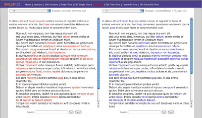
The look and feel of the entire application can be changed by simply altering the CSS and XSL stylesheets for each page. I have therefore executed an extreme makeover for the demonstration in Oulu. It now conforms to what users expect of a simple, clear interface, even though the functionality is exactly the same as before. This is more than just window-dressing, however. It is important, for example, that the search box positions itself automatically at the bottom of the window however large it is, also that the width of Twin View does not exceed that of a normal laptop screen size (1024x768). And fixed column widths are now the norm in a world in which wide screens are commonplace. This was never an issue when people had screens of 800x600 pixels in size. Then you wanted your webpage to stretch the full width, so that resizing of the window caused the text to reflow. As typographers will tell you, however, text is most easily read in narrow columns. I'm unsure what width to use but I chose sizes that seem to be widely used: 660 for Single View and 480 for each of the columns in Twin View. It looks particularly good on OSX, nearly as good in Firefox on the PC and not very good at all in Internet Explorer. In fact getting it to look nearly the same in IE and Firefox is quite hard.

I didn't get as much finished for the conference as I hoped, but it is still quite a lot. I would estimate that the application is about 70-80% finished, and that it could certainly be completed by the end of the year.
Monday, June 16, 2008

Lost in Hyperspace

The drawback with TwinView is that, in spite of its power to display the differences between two versions, it becomes so hard to see what is the same. After a few insertions and deletions on each side the two columns quickly get out of alignment. When the user scrolls down to study a bit of text how does he or she find the corresponding text in the other version? Without synchronisation you are forced to scroll up and down manually to try to match up the texts when the computer should be really be doing all that for you in the blink of an eye.

The possibilities of providing visual cues in a web browser to indicate alignment are quite limited. There is no way, for example, to connect text blocks using lines that cross from one window to another, as in Nelson's Parallel Textface. And it is very difficult or impossible (at least I can't see how) to synchronise the scrolling of two <div>s in parallel. On the other hand, maybe something simpler might actually be more effective. The technique I eventually settled on uses <span> and the onclick attribute. When the user clicks on a bit of black text common to both sides it causes the corresponding text in the other frame to scroll down to precisely the same position as the clicked-on text, and then highlights it. Using <span> instead of hyperlinks has the advantage that the text is still selectable – very handy for choosing and copying text to search for in other versions. It is also intuitive: a naïve user will eventually click on the text and discover the alignment facility. (Text copyright Vicenzo Cerami)

Before the click on the left – hopelessly out of alignment

... and after – beautifully aligned and everything clear.

Sunday, June 8, 2008

Search

One of the major advantages of the MVD format is the ability to search all versions simultaneously. The search implementation in the underlying platform (as in MVDDeskViewer) has been around for some time, but making it available in the wiki, where the search results have to be sent to the browser as HTML, and the text highlighted and merged with other highlighted text, was not easy. However, it all seems to work fine now.

The user can search only the currently selected version (that's the ">" button in the image below) or all versions (the ">>" button). When searching all versions the display loads new versions as needed; it also updates the other window to reflect the different insertions or deletions with respect to the new version. You may search in either the left-hand or right-hand window in TwinView. Repeated clicks on a search button find successive matches starting from the current version; it also wraps around at the end, eventually taking you back to your original version.

Bug Fixes

This iteration also removes some outstanding bugs which appear only on Windows in Internet Explorer particularly. In EditVersions previously if you chose to edit, add or delete a version or group in a Windows browser it usually failed. Thankfully, it doesn't do so any more. I have tested it on Firefox and IE6 on Windows XP, and also on Safari and Firefox on Mac OSX.

Wish-list

There remain, however, some deficiencies:

  • Because each set of search results are sent to the browser, the entire text of each version, or pair of versions, has to be sent each time, making the response seem a bit slow, when in fact the search itself is really fast. I need to use AJAX here to only send the differences and update the HTML. However, this is not a real problem at the moment because the client and server are on the same machine.
  • Because I am developing on a very wide screen I tend to forget how little screen space there is on the average laptop. The buttons on the left of the display are a serious problem in TwinView, and will have to be moved above the text-columns as a matter of some urgency.
  • Also urgent is providing some means of synchronisation between columns in TwinView. I tried but failed in this iteration to make it align the text on one side whenever you click on the text on the other. Getting this to work cross-browser in JavaScript, however, has so far eluded me.
Here is another screen dump showing how it displays search hits using a background colour and <span> elements in HTML. This is a bit of kludge, but using real selections, as you do with a mouse, doesn't work on all browsers. (Text © N. Brocca 2008)